Which Neuromarketing Tactics Work the Best for Chocolate Packaging?
Businesses run on smart strategies that make them excel in the market. One such tactic is to play with the customer’s perception. Have you ever wondered why some people lean toward certain items more easily than others? The reason is simple- because of the packaging. Food companies use stylish chocolate boxes to make the buyers’ mouths water before they even open the wrapper. This blog will uncover which of the strategies works perfectly in hitting the sweet spot of the consumers and why they cannot resist that crunchy crackle sound of the chocolates. Let’s figure it out!
What is Neuromarketing?
Neuromarketing is a smart way of studying how people think, feel, and make buying choices. It uses science to understand what goes on in the brain when someone looks at a product. Brands use this to find out what makes people say yes to a product without them even knowing it.
It works by looking at brain activity, heart rate, eye movements, and emotions. This helps companies know what customers love or ignore. It’s not guessing. It’s real research based on how the mind works.
For example, if someone feels happy looking at a certain color, a brand may use that color more often. If a certain shape makes people feel calm, they’ll use that shape. It’s all about small things that make a big difference.
Neuromarketing is not just for ads. It helps in designing packaging, placing products in stores, and choosing sounds, smells, and even fonts. Every small choice is tested to see how it affects the customer’s brain.
In short, neuromarketing helps brands connect better with people. It’s like getting inside the shopper’s mind to know what truly works. And when used right, it makes products more appealing, more enjoyable, and more likely to be picked off the shelf.
Best Neuromarketing Strategy for Chocolate Boxes
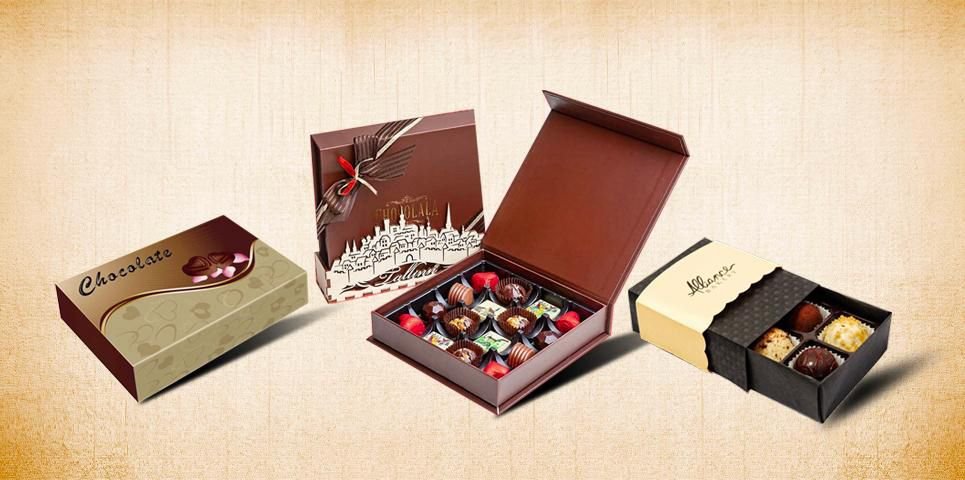
This section will now explore which strategy is more suitable in neuromarketing for the chocolate boxes. To grab the customer’s eye, brands make their chocolate packaging as attractive as possible. This involves using catchy images, adding decor items, and even turning the boxes into different shapes, as per the request of their clients. Let’s see which of the tactics works the best:
Typography
Typography is the style of letters used on chocolate packaging. It may look small, but it plays a major role in how people feel about a product. The size, shape, and spacing of letters can all affect how a message is received. For example, big, bold letters can make the chocolate feel strong and exciting.
On the other hand, soft, round letters can make it feel smooth and sweet. If the letters are printed in a curvy style, then customers may not trust the brand or understand the product. The brands need to go for clean and simple fonts that are easier on the eyes and help buyers read faster.
Moreover, the position of the texts is equally important. Some brands place the text in the center to grab attention. Other chocolate companies highlight words like new, limited, or rich flavor in a fun font, which creates interest. Typography narrates the brand’s story to the buyers.
With the right style, words can tempt, comfort, and even excite customers- just by the way they look. That is why choosing the right font style is key in smart packaging.
Colors
Another strategy that makes or breaks the brand impression is the color. Colors have a powerful tendency to trigger emotions in humans. Colors help improve brain activity far better than plain packaging.
When it comes to chocolate packaging, brands throw in different hues on the boxes to make them enticing. Each color brings out a different feeling. Red color evokes a sense of excitement while orange gives a sense of warmth. Moreover, the blue color provides a cooling effect on the mind and the eyes. Green is often used for mint or organic chocolates. It gives a fresh and natural vibe. Yellow brings a happy, joyful feel and is used in kids’ chocolate.
Gold and silver give the chocolate a fancy look. They make the product feel premium or special, like a treat for a celebration. Dark colors like black or deep purple can make the chocolate seem more luxurious and elegant. Even soft colors like pastels are used for white chocolate or flavored varieties. They make the product feel light and delicate.
Hence, colors can mess with the consumers’ minds, urging them to make a quick buying decision of the chocolates.
Texture
Touch is just as important as sight. When someone picks up a box, the way it feels can shape their opinion in seconds. A soft and gentle surface feels nice, making the product feel special. If the box feels smooth, it gives a calm and rich vibe. It’s like holding something that was made with care.
Some chocolate boxes feel firm and solid. This gives the buyers a sense that the product inside is strong and full. Others have tiny patterns or raised parts that make the touch more fun and interesting. It adds a little surprise to the hands. Some buyers enjoy a grainy or natural surface. It reminds them of sustainability.
Having a smooth texture enhances the tactile experience of the customers. Brands create a level of trust with the buyers by offering them a great touch moment.
Final Words
This blog has shared which neuromarketing tactic works well when it comes to attracting buyers. While textures and font styling are essential, colors tend to make a stronger impact on the buyers’ decisions. The first thing that consumers notice in the market is the color of the packaging. Brands add striking colors on chocolate boxes to make them more catchy. If you want to design the best quality chocolate display boxes, then contact Packaging Mania to get customised packaging at a reasonable rate.